
2023
AlteaCare: Small Changer, Big Impact
Portfolio
First Iteration
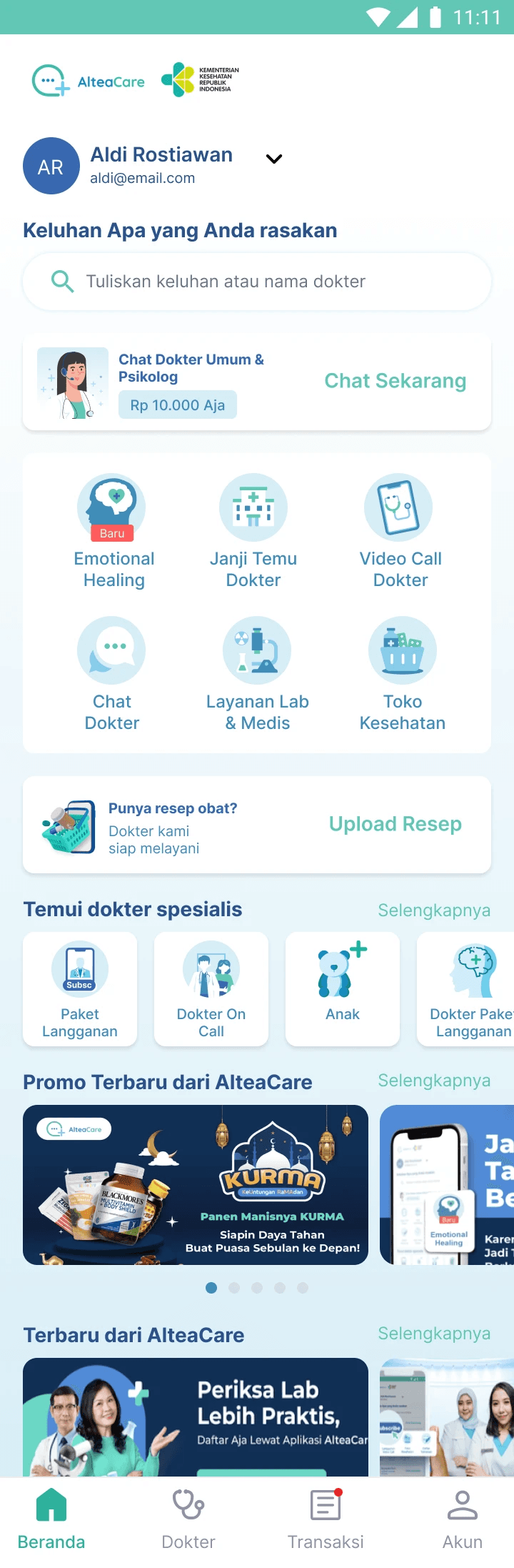
AlteaCare brings patients and doctors together on a single platform. You can consult specialist doctors, get checkup, order medicines, and buy vitamins using the official apps on Android and iOS. We aim to boost clicks on the homepage of the AlteaCare app to counter its high bounce rate
How we can increase click of the features in the home page
Analyze the current data
I reviewed how many clicks there are on each feature and how many users actually make transactions on each feature based on the latest data provided by the product manager.
First Iteration: Change the copywriting of the button
We assumed that the feature names were ambiguous; for example, the 'Emotional Healing' feature name does not define what is inside the feature. So we changed it to be more concise and straightforward. Cek Kondisi Psikologis' (that is translated to English as Check Psychology Condition").
We did this to every feature; we changed the name to more of a 'verb', so the user instantly knew what it meant.
Testing the new wording on Useberry
Before putting it into development, we tested it on Useberry, a website for identifying usability issues, understanding user perspectives, and making necessary adjustments.
We conducted tests with 10 patients from Mitra Keluarga Hospital: the initial 5 users interacted with the app using the new wording, while the remaining 5 used the old wording. The results indicated that users with the updated wording grasped and located the feature more quickly, whereas those exposed to the old wording struggled to locate the features.
Release on a live Android and iOS App
The results showed an increase of roughly 15% in clicks for each feature within one week after the changes. This image below is for illustration only of the dashboard widget click, not the real result.


Second Iteration
What happened if we do a second iteration?
Second Iteration: Change the icon illustration
It began because AlteaCare's previous design team (Syarifudin, Willy, and Badai) had already created a completely new home design based on usability testing and user feedback. However, this development takes weeks to complete, and the developers at the time were swamped with work. As a result, it is impossible to switch to a new design in time.
More Works
©2024
2023
AlteaCare: Small Changer, Big Impact
Portfolio
First Iteration
AlteaCare brings patients and doctors together on a single platform. You can consult specialist doctors, get checkup, order medicines, and buy vitamins using the official apps on Android and iOS. We aim to boost clicks on the homepage of the AlteaCare app to counter its high bounce rate
How we can increase click of the features in the home page
Analyze the current data
I reviewed how many clicks there are on each feature and how many users actually make transactions on each feature based on the latest data provided by the product manager.
First Iteration: Change the copywriting of the button
We assumed that the feature names were ambiguous; for example, the 'Emotional Healing' feature name does not define what is inside the feature. So we changed it to be more concise and straightforward. Cek Kondisi Psikologis' (that is translated to English as Check Psychology Condition").
We did this to every feature; we changed the name to more of a 'verb', so the user instantly knew what it meant.
Testing the new wording on Useberry
Before putting it into development, we tested it on Useberry, a website for identifying usability issues, understanding user perspectives, and making necessary adjustments.
We conducted tests with 10 patients from Mitra Keluarga Hospital: the initial 5 users interacted with the app using the new wording, while the remaining 5 used the old wording. The results indicated that users with the updated wording grasped and located the feature more quickly, whereas those exposed to the old wording struggled to locate the features.
Release on a live Android and iOS App
The results showed an increase of roughly 15% in clicks for each feature within one week after the changes. This image below is for illustration only of the dashboard widget click, not the real result.
Second Iteration
What happened if we do a second iteration?
Second Iteration: Change the icon illustration
It began because AlteaCare's previous design team (Syarifudin, Willy, and Badai) had already created a completely new home design based on usability testing and user feedback. However, this development takes weeks to complete, and the developers at the time were swamped with work. As a result, it is impossible to switch to a new design in time.
More Works
©2024