2024
Self-Service Kiosk V.4.0
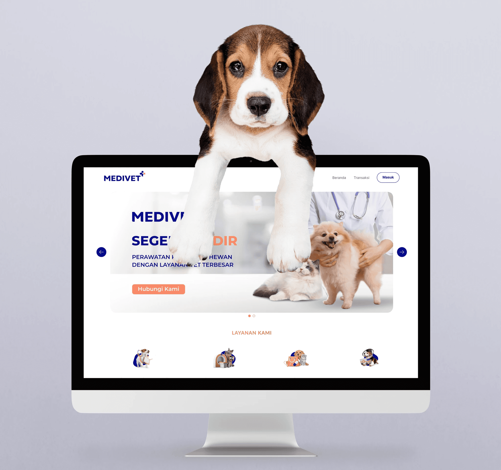
Portfolio
Know More
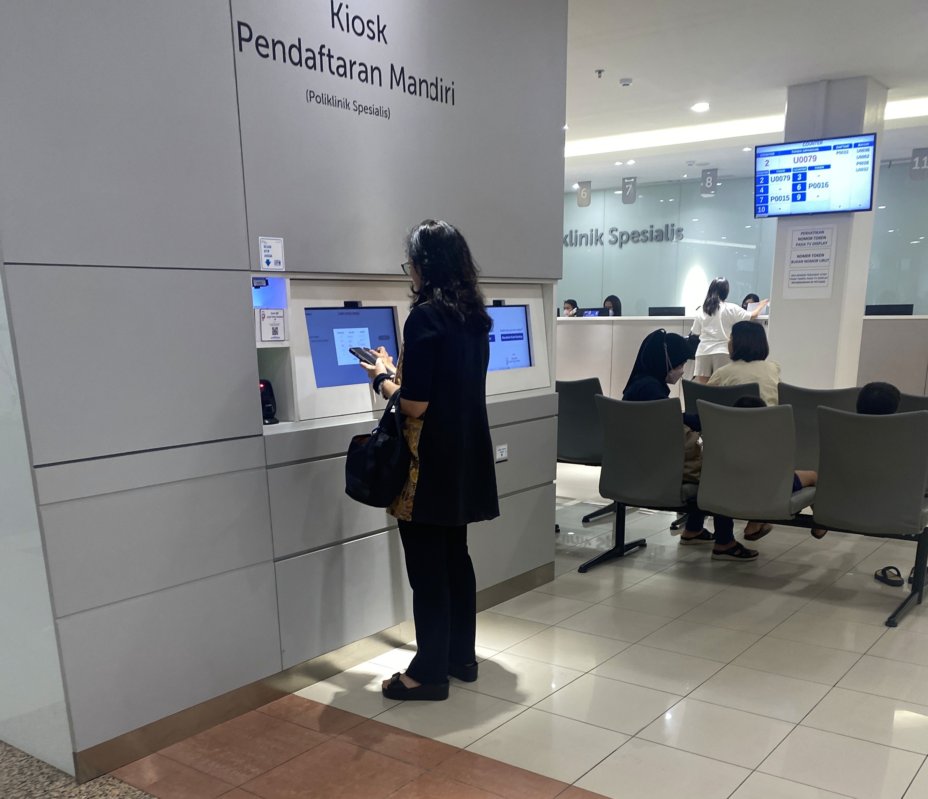
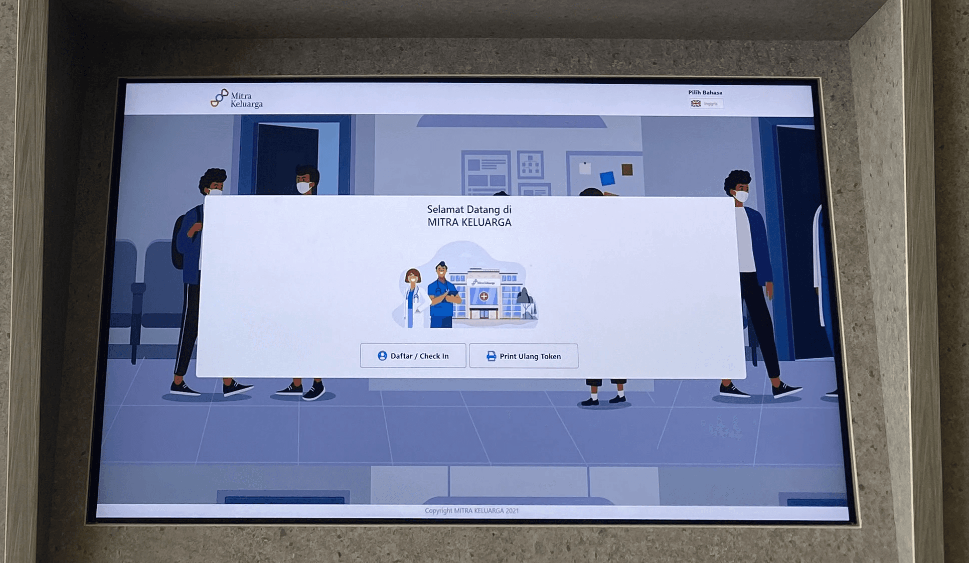
We have a self-service kiosks to help patients check in more quickly.
But the interface is too confusing and people still need help from staff—what’s the point? It ends up slowing things down instead of making it faster.
How might we improve the kiosk’s interface so patients can navigate it independently and with confidence?
The Problems
From observations and usability testing sessions with MIKA patients, particularly those aged 40 and above, I discovered the following behavior patterns and challenges:
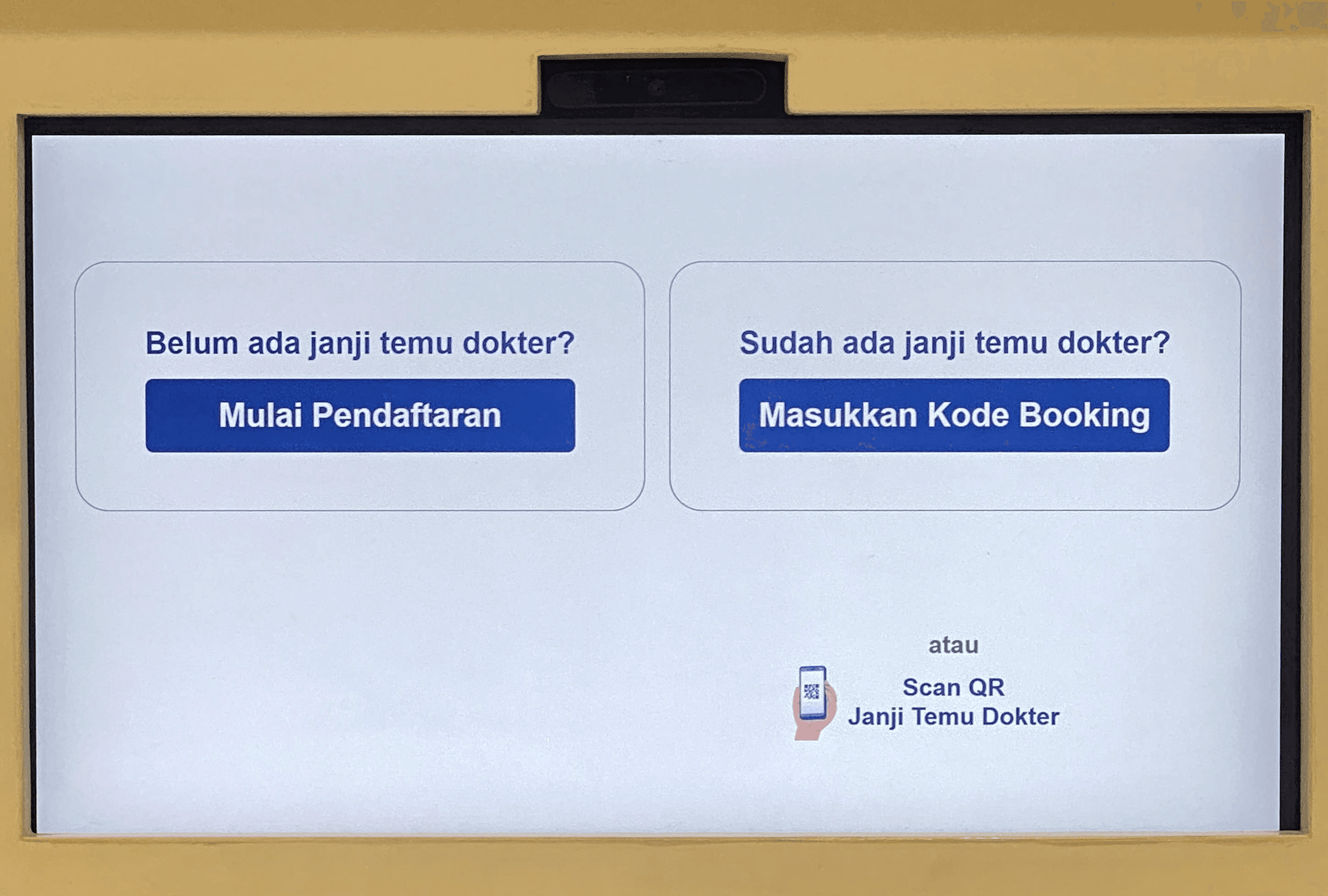
Hesitation due to long texts: Users often paused for long periods, unsure of what to do next due to long text.
Reliance on staff: Many users abandoned the kiosk midway and asked for help, even for simple steps like entering their name or selecting a service.
Missed buttons or selections: Some users did not realize certain elements were clickable or struggled with small touch targets.
Difficulty reading the screen: Font sizes were too small, especially for users with presbyopia.
Problem
The Solutions
To address these behavioral insights, we implemented the following solutions in Self-Service Kiosk V.4.0:
Larger Fonts and Buttons
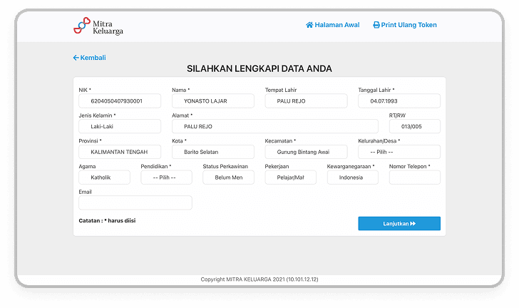
Increased font size and padding on interactive elements to improve readability and tap accuracy.Step-by-Step Guidance
Redesigned the flow to be linear, showing only one clear action per screen (e.g. “Enter ID”, then “Select Service”).Progress Indicators
Added a visible progress bar to let users know how many steps remain, which reduced anxiety and dropout.Clearer Visual Hierarchy
Used consistent layout patterns, spacing, and color contrast to direct attention to the primary action (e.g. “Next” or “Confirm”).Error Prevention & Help Prompts
Simplified error messages and added tooltips or helper text to guide users when they seemed stuck or made common mistakes.

Solution
Self-Service Kiosk V.3.0 vs V.4.0 — Key Improvements
Font Size
V.3.0 (Before): Small and hard to read, especially for older users.
V.4.0 (After): Increased font size for better readability and accessibility.
Button Clarity
V.3.0 (Before): Used ambiguous icons or unclear terminology.
V.4.0 (After): Replaced with clear, descriptive labels like "Check In", "Next", and "Back".
Navigation Flow
V.3.0 (Before): Unstructured flow with too many options on screen at once.
V.4.0 (After): Simplified into a step-by-step linear process to guide users confidently.
Accessibility
V.3.0 (Before): Not tailored for elderly or low-vision users.
V.4.0 (After): Redesigned with accessibility in mind, following WCAG guidelines and tested with real users.
More Works
©2024

2024
Self-Service Kiosk V.4.0
Portfolio
Know More
We have a self-service kiosks to help patients check in more quickly.
But the interface is too confusing and people still need help from staff—what’s the point? It ends up slowing things down instead of making it faster.
How might we improve the kiosk’s interface so patients can navigate it independently and with confidence?
The Problems
From observations and usability testing sessions with MIKA patients, particularly those aged 40 and above, I discovered the following behavior patterns and challenges:
Hesitation due to long texts: Users often paused for long periods, unsure of what to do next due to long text.
Reliance on staff: Many users abandoned the kiosk midway and asked for help, even for simple steps like entering their name or selecting a service.
Missed buttons or selections: Some users did not realize certain elements were clickable or struggled with small touch targets.
Difficulty reading the screen: Font sizes were too small, especially for users with presbyopia.
Problem
The Solutions
To address these behavioral insights, we implemented the following solutions in Self-Service Kiosk V.4.0:
Larger Fonts and Buttons
Increased font size and padding on interactive elements to improve readability and tap accuracy.Step-by-Step Guidance
Redesigned the flow to be linear, showing only one clear action per screen (e.g. “Enter ID”, then “Select Service”).Progress Indicators
Added a visible progress bar to let users know how many steps remain, which reduced anxiety and dropout.Clearer Visual Hierarchy
Used consistent layout patterns, spacing, and color contrast to direct attention to the primary action (e.g. “Next” or “Confirm”).Error Prevention & Help Prompts
Simplified error messages and added tooltips or helper text to guide users when they seemed stuck or made common mistakes.
Solution
Self-Service Kiosk V.3.0 vs V.4.0 — Key Improvements
Font Size
V.3.0 (Before): Small and hard to read, especially for older users.
V.4.0 (After): Increased font size for better readability and accessibility.
Button Clarity
V.3.0 (Before): Used ambiguous icons or unclear terminology.
V.4.0 (After): Replaced with clear, descriptive labels like "Check In", "Next", and "Back".
Navigation Flow
V.3.0 (Before): Unstructured flow with too many options on screen at once.
V.4.0 (After): Simplified into a step-by-step linear process to guide users confidently.
Accessibility
V.3.0 (Before): Not tailored for elderly or low-vision users.
V.4.0 (After): Redesigned with accessibility in mind, following WCAG guidelines and tested with real users.
More Works
©2024